
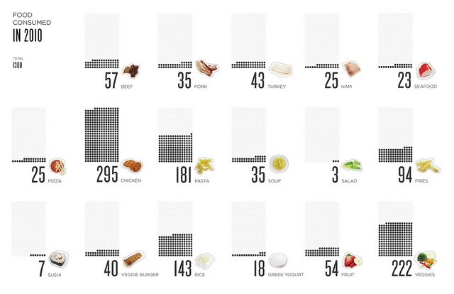
" 'It’s like comparing apples to oranges.' This phrase is the best way to describe the current state of data visualizations. For the designer, its easy to find good visualizations and bad ones, but how to apply the successful elements of particular designs to one’s own data set starts to get a little more complicated. Data sets vary tremendously, so one man’s brilliant solution can be another’s complete failure. Instead of seeing many excellent visualizations of all different data sets, what if you could see tons of visualizations of the same data set? What new comparisons, knowledge and structure might be developed from this?"

