
Computer Scientists at Harvard and Cognitive Scientists at MIT team up to settle a debate over "Chart Junk"
"It’s easy to spot a “bad” data visualization—one packed with too much text, excessive ornamentation, gaudy colors, and clip art. Design guru Edward Tufte derided such decorations as redundant at best, useless at worst, labeling them “chart junk.” Yet a debate still rages among visualization experts: Can these reviled extra elements serve a purpose? Taking a scientific approach to design, researchers from Harvard University and Massachusetts Institute of Technology are offering a new take on that debate. The same design elements that attract so much criticism, they report, can also make a visualization more memorable."
“A visualization will be instantly and overwhelmingly more memorable if it incorporates an image of a human-recognizable object—if it includes a photograph, people, cartoons, logos—any component that is not just an abstract data visualization,” says Pfister. “We learned that any time you have a graphic with one of those components, that’s the most dominant thing that affects the memorability.”
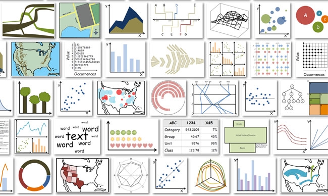
"Visualizations that were visually dense proved memorable, as did those that used many colors. Other results were more surprising."
“You’d think the types of charts you’d remember best are the ones you learned in school—the bar charts, pie charts, scatter plots, and so on,” Borkin says. “But it was the opposite.”
Unusual types of charts, like tree diagrams, network diagrams, and grid matrices, were actually more memorable."
“If you think about those types of diagrams—for example, tree diagrams that show relationships between species, or diagrams that explain a molecular chemical process—every one of them is going to be a little different, but the branching structures feel very natural to us,” explains Borkin. “That combination of the familiar and the unique seems to influence the memorability.”
“A graph can be simple or complex, and they both can be memorable,” explains Oliva. “You can make something familiar either by keeping it simple or by having a little story around it. It’s not really that you should choose to use one color or many, or to include additional ornaments or not. If you need to keep it simple because it’s the style your boss likes or the style of your publication, you can still find a way to make it memorable.”
“A memorable visualization is not necessarily a good visualization,” Borkin cautions. “As a community we need to keep asking these types of questions: What makes a visualization engaging? What makes it comprehensible?”
As for the chart junk, she says diplomatically, “I think it’s going to be an ongoing debate.”

